{"title":"从理论到实践:建筑色彩设计的愉悦唤起主导(PAD)理论","authors":"Ellen Divers","doi":"10.1002/col.22847","DOIUrl":null,"url":null,"abstract":"<p>Designers are often called upon to design therapeutic spaces that serve people who are in fragile emotional and/or physical states. While there is considerable guidance on designing for function in these spaces, the evidence-based guidance on aesthetics is virtually non-existent, especially when it comes to color. For a long time, the prevailing assumption in these studies, and among the public in general, has been that hues are the drivers of emotional content (e.g., red is exciting and blue is calming) and they have, for the most part, disregarded the distinct emotional connotations of light, dark, and muted versions of a hue. This oversight has led to unfortunate outcomes in the real world. The idea that blue is calming, for instance, has paved the way for brand new state-of-the-art facilities featuring light blue walls that occupants may read as cold and unwelcoming. Designers need a rational, evidence-based approach that helps them understand what many of them already know intuitively: spaces can be calm and inviting without being blue. After an overview of the design process, this article proposes that Pleasure-Arousal-Dominance (PAD) theory may aid designers to better understand that pale and dark (high and low value) colors convey opposites messages related to strength/power (dominance), and that vivid and muted colors (high and low chroma) convey opposite messages about energy/activity level (arousal). Finally, the author illustrates how this thought process might be applied in an architectural design practice.</p>","PeriodicalId":10459,"journal":{"name":"Color Research and Application","volume":"48 5","pages":"445-452"},"PeriodicalIF":1.2000,"publicationDate":"2023-02-24","publicationTypes":"Journal Article","fieldsOfStudy":null,"isOpenAccess":false,"openAccessPdf":"","citationCount":"2","resultStr":"{\"title\":\"Theory to practice: Pleasure-Arousal-Dominance (PAD) theory for architectural color design\",\"authors\":\"Ellen Divers\",\"doi\":\"10.1002/col.22847\",\"DOIUrl\":null,\"url\":null,\"abstract\":\"<p>Designers are often called upon to design therapeutic spaces that serve people who are in fragile emotional and/or physical states. While there is considerable guidance on designing for function in these spaces, the evidence-based guidance on aesthetics is virtually non-existent, especially when it comes to color. For a long time, the prevailing assumption in these studies, and among the public in general, has been that hues are the drivers of emotional content (e.g., red is exciting and blue is calming) and they have, for the most part, disregarded the distinct emotional connotations of light, dark, and muted versions of a hue. This oversight has led to unfortunate outcomes in the real world. The idea that blue is calming, for instance, has paved the way for brand new state-of-the-art facilities featuring light blue walls that occupants may read as cold and unwelcoming. Designers need a rational, evidence-based approach that helps them understand what many of them already know intuitively: spaces can be calm and inviting without being blue. After an overview of the design process, this article proposes that Pleasure-Arousal-Dominance (PAD) theory may aid designers to better understand that pale and dark (high and low value) colors convey opposites messages related to strength/power (dominance), and that vivid and muted colors (high and low chroma) convey opposite messages about energy/activity level (arousal). Finally, the author illustrates how this thought process might be applied in an architectural design practice.</p>\",\"PeriodicalId\":10459,\"journal\":{\"name\":\"Color Research and Application\",\"volume\":\"48 5\",\"pages\":\"445-452\"},\"PeriodicalIF\":1.2000,\"publicationDate\":\"2023-02-24\",\"publicationTypes\":\"Journal Article\",\"fieldsOfStudy\":null,\"isOpenAccess\":false,\"openAccessPdf\":\"\",\"citationCount\":\"2\",\"resultStr\":null,\"platform\":\"Semanticscholar\",\"paperid\":null,\"PeriodicalName\":\"Color Research and Application\",\"FirstCategoryId\":\"5\",\"ListUrlMain\":\"https://onlinelibrary.wiley.com/doi/10.1002/col.22847\",\"RegionNum\":3,\"RegionCategory\":\"工程技术\",\"ArticlePicture\":[],\"TitleCN\":null,\"AbstractTextCN\":null,\"PMCID\":null,\"EPubDate\":\"\",\"PubModel\":\"\",\"JCR\":\"Q4\",\"JCRName\":\"CHEMISTRY, APPLIED\",\"Score\":null,\"Total\":0}","platform":"Semanticscholar","paperid":null,"PeriodicalName":"Color Research and Application","FirstCategoryId":"5","ListUrlMain":"https://onlinelibrary.wiley.com/doi/10.1002/col.22847","RegionNum":3,"RegionCategory":"工程技术","ArticlePicture":[],"TitleCN":null,"AbstractTextCN":null,"PMCID":null,"EPubDate":"","PubModel":"","JCR":"Q4","JCRName":"CHEMISTRY, APPLIED","Score":null,"Total":0}
Theory to practice: Pleasure-Arousal-Dominance (PAD) theory for architectural color design
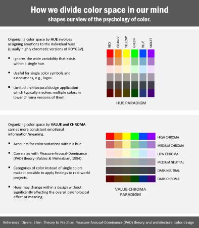
Designers are often called upon to design therapeutic spaces that serve people who are in fragile emotional and/or physical states. While there is considerable guidance on designing for function in these spaces, the evidence-based guidance on aesthetics is virtually non-existent, especially when it comes to color. For a long time, the prevailing assumption in these studies, and among the public in general, has been that hues are the drivers of emotional content (e.g., red is exciting and blue is calming) and they have, for the most part, disregarded the distinct emotional connotations of light, dark, and muted versions of a hue. This oversight has led to unfortunate outcomes in the real world. The idea that blue is calming, for instance, has paved the way for brand new state-of-the-art facilities featuring light blue walls that occupants may read as cold and unwelcoming. Designers need a rational, evidence-based approach that helps them understand what many of them already know intuitively: spaces can be calm and inviting without being blue. After an overview of the design process, this article proposes that Pleasure-Arousal-Dominance (PAD) theory may aid designers to better understand that pale and dark (high and low value) colors convey opposites messages related to strength/power (dominance), and that vivid and muted colors (high and low chroma) convey opposite messages about energy/activity level (arousal). Finally, the author illustrates how this thought process might be applied in an architectural design practice.
期刊介绍:
Color Research and Application provides a forum for the publication of peer-reviewed research reviews, original research articles, and editorials of the highest quality on the science, technology, and application of color in multiple disciplines. Due to the highly interdisciplinary influence of color, the readership of the journal is similarly widespread and includes those in business, art, design, education, as well as various industries.
 求助内容:
求助内容: 应助结果提醒方式:


