Simon L Turner, Amalia Karahalios, Elizabeth Korevaar, Joanne E McKenzie
{"title":"银行图:一种直观比较不同数据集的点估计值和置信区间的方法。","authors":"Simon L Turner, Amalia Karahalios, Elizabeth Korevaar, Joanne E McKenzie","doi":"10.1016/j.jclinepi.2024.111591","DOIUrl":null,"url":null,"abstract":"<p><strong>Objective: </strong>In research evaluating statistical analysis methods, a common aim is to compare point estimates and confidence intervals (CIs) calculated from different analyses. This can be challenging when the outcomes (and their scale ranges) differ across datasets. We therefore developed a graphical method, the 'Banksia plot', to facilitate pairwise comparisons of different statistical analysis methods by plotting and comparing point estimates and confidence intervals from each analysis method both within and across datasets.</p><p><strong>Study design and setting: </strong>The plot is constructed in three stages. Stage 1: To compare results of two statistical analysis methods, for each dataset, the point estimate from the reference analysis method is centred on zero, and its confidence limits are scaled to range from -0.5 to 0.5. The same centring and scale adjustment values are then applied to the corresponding comparator analysis point estimate and confidence limits. Stage 2: A Banksia plot is constructed by plotting the centred and scaled point estimates from the comparator method for each dataset on a rectangle centred at zero, ranging from -0.5 to 0.5, which represents the reference method results. Stage 3: Optionally, a matrix of Banksia plots is graphed, showing all pairwise comparisons from multiple analysis methods. We illustrate the Banksia plot using two examples.</p><p><strong>Results: </strong>Illustration of the Banksia plot demonstrates how the plot makes immediately apparent whether there are differences in point estimates and confidence intervals when using different analysis methods (example 1), or different data extractors (example 2). Furthermore, we demonstrate how different bases for ordering the confidence intervals can be used to highlight particular differences (i.e. in point estimates, or confidence interval widths).</p><p><strong>Conclusion: </strong>The Banksia plot provides a visual summary of pairwise comparisons of different analysis methods, allowing patterns and trends in the point estimates and confidence intervals to be easily identified.</p>","PeriodicalId":51079,"journal":{"name":"Journal of Clinical Epidemiology","volume":" ","pages":"111591"},"PeriodicalIF":7.3000,"publicationDate":"2024-11-06","publicationTypes":"Journal Article","fieldsOfStudy":null,"isOpenAccess":false,"openAccessPdf":"","citationCount":"0","resultStr":"{\"title\":\"The Banksia plot: a method for visually comparing point estimates and confidence intervals across datasets.\",\"authors\":\"Simon L Turner, Amalia Karahalios, Elizabeth Korevaar, Joanne E McKenzie\",\"doi\":\"10.1016/j.jclinepi.2024.111591\",\"DOIUrl\":null,\"url\":null,\"abstract\":\"<p><strong>Objective: </strong>In research evaluating statistical analysis methods, a common aim is to compare point estimates and confidence intervals (CIs) calculated from different analyses. This can be challenging when the outcomes (and their scale ranges) differ across datasets. We therefore developed a graphical method, the 'Banksia plot', to facilitate pairwise comparisons of different statistical analysis methods by plotting and comparing point estimates and confidence intervals from each analysis method both within and across datasets.</p><p><strong>Study design and setting: </strong>The plot is constructed in three stages. Stage 1: To compare results of two statistical analysis methods, for each dataset, the point estimate from the reference analysis method is centred on zero, and its confidence limits are scaled to range from -0.5 to 0.5. The same centring and scale adjustment values are then applied to the corresponding comparator analysis point estimate and confidence limits. Stage 2: A Banksia plot is constructed by plotting the centred and scaled point estimates from the comparator method for each dataset on a rectangle centred at zero, ranging from -0.5 to 0.5, which represents the reference method results. Stage 3: Optionally, a matrix of Banksia plots is graphed, showing all pairwise comparisons from multiple analysis methods. We illustrate the Banksia plot using two examples.</p><p><strong>Results: </strong>Illustration of the Banksia plot demonstrates how the plot makes immediately apparent whether there are differences in point estimates and confidence intervals when using different analysis methods (example 1), or different data extractors (example 2). Furthermore, we demonstrate how different bases for ordering the confidence intervals can be used to highlight particular differences (i.e. in point estimates, or confidence interval widths).</p><p><strong>Conclusion: </strong>The Banksia plot provides a visual summary of pairwise comparisons of different analysis methods, allowing patterns and trends in the point estimates and confidence intervals to be easily identified.</p>\",\"PeriodicalId\":51079,\"journal\":{\"name\":\"Journal of Clinical Epidemiology\",\"volume\":\" \",\"pages\":\"111591\"},\"PeriodicalIF\":7.3000,\"publicationDate\":\"2024-11-06\",\"publicationTypes\":\"Journal Article\",\"fieldsOfStudy\":null,\"isOpenAccess\":false,\"openAccessPdf\":\"\",\"citationCount\":\"0\",\"resultStr\":null,\"platform\":\"Semanticscholar\",\"paperid\":null,\"PeriodicalName\":\"Journal of Clinical Epidemiology\",\"FirstCategoryId\":\"3\",\"ListUrlMain\":\"https://doi.org/10.1016/j.jclinepi.2024.111591\",\"RegionNum\":2,\"RegionCategory\":\"医学\",\"ArticlePicture\":[],\"TitleCN\":null,\"AbstractTextCN\":null,\"PMCID\":null,\"EPubDate\":\"\",\"PubModel\":\"\",\"JCR\":\"Q1\",\"JCRName\":\"HEALTH CARE SCIENCES & SERVICES\",\"Score\":null,\"Total\":0}","platform":"Semanticscholar","paperid":null,"PeriodicalName":"Journal of Clinical Epidemiology","FirstCategoryId":"3","ListUrlMain":"https://doi.org/10.1016/j.jclinepi.2024.111591","RegionNum":2,"RegionCategory":"医学","ArticlePicture":[],"TitleCN":null,"AbstractTextCN":null,"PMCID":null,"EPubDate":"","PubModel":"","JCR":"Q1","JCRName":"HEALTH CARE SCIENCES & SERVICES","Score":null,"Total":0}
The Banksia plot: a method for visually comparing point estimates and confidence intervals across datasets.
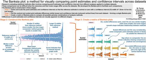
Objective: In research evaluating statistical analysis methods, a common aim is to compare point estimates and confidence intervals (CIs) calculated from different analyses. This can be challenging when the outcomes (and their scale ranges) differ across datasets. We therefore developed a graphical method, the 'Banksia plot', to facilitate pairwise comparisons of different statistical analysis methods by plotting and comparing point estimates and confidence intervals from each analysis method both within and across datasets.
Study design and setting: The plot is constructed in three stages. Stage 1: To compare results of two statistical analysis methods, for each dataset, the point estimate from the reference analysis method is centred on zero, and its confidence limits are scaled to range from -0.5 to 0.5. The same centring and scale adjustment values are then applied to the corresponding comparator analysis point estimate and confidence limits. Stage 2: A Banksia plot is constructed by plotting the centred and scaled point estimates from the comparator method for each dataset on a rectangle centred at zero, ranging from -0.5 to 0.5, which represents the reference method results. Stage 3: Optionally, a matrix of Banksia plots is graphed, showing all pairwise comparisons from multiple analysis methods. We illustrate the Banksia plot using two examples.
Results: Illustration of the Banksia plot demonstrates how the plot makes immediately apparent whether there are differences in point estimates and confidence intervals when using different analysis methods (example 1), or different data extractors (example 2). Furthermore, we demonstrate how different bases for ordering the confidence intervals can be used to highlight particular differences (i.e. in point estimates, or confidence interval widths).
Conclusion: The Banksia plot provides a visual summary of pairwise comparisons of different analysis methods, allowing patterns and trends in the point estimates and confidence intervals to be easily identified.
期刊介绍:
The Journal of Clinical Epidemiology strives to enhance the quality of clinical and patient-oriented healthcare research by advancing and applying innovative methods in conducting, presenting, synthesizing, disseminating, and translating research results into optimal clinical practice. Special emphasis is placed on training new generations of scientists and clinical practice leaders.